What the MVP Taught Us
Three Findings That Changed the Next Phase.
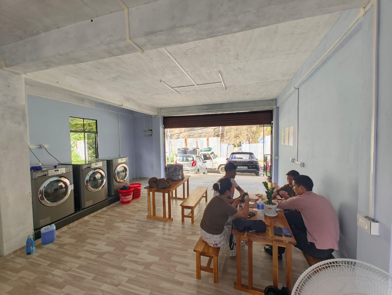
The soft launch ran as a research exercise as much as a product test. Students used the space, were observed, and a small group of regulars became ongoing research partners. Three things came back clearly enough to act on.
The drying machine became the primary retention driver, not the convenience positioning we led with. During monsoon and winter months when air drying takes one to two days, collecting clean dry clothes in under an hour was the thing students cited when asked why they came back. The value proposition we designed around turned out to be secondary to one we underestimated. The full launch messaging is being adjusted accordingly.
The waiting experience produced the clearest unsolicited signal. Board games were requested, introduced, and adopted quickly. A café or beverage element came up independently from multiple users without any prompting on our end. It confirmed a feature that was already planned for the full launch. When users organically ask for something you were already building, that is about as close to validation as a soft launch gets.
Pricing objections resolved every time the all-inclusive breakdown was explained. Water, detergent, machine use, drying. Once students understood what was covered, the objection disappeared. That pattern identified a communication gap in the physical space, not a problem with the pricing itself. The full launch needs to do that explanatory work before anyone has to ask.
Instruction Design: V1 vs V2
The original in-store instructions relied on bilingual text side by side. In practice, first-time visitors found it too dense to parse quickly. One round of observation was enough to identify the problem.
Bilingual text (English + local language) displayed side by side. Full sentences, multiple steps visible at once. Too much to process for someone navigating an unfamiliar environment on their first visit.
Icon-based flow: Pay, Wash, Dry, Done. One action per panel. Minimal text. Works regardless of which language the user is most comfortable in.
What Didn't Land
The most consistent criticism from vendors in the area and some older visitors was about the physical space. It didn't look finished enough to draw people in from the street. This is a known constraint of the MVP. The brand identity exists. The environment hasn't caught up to it yet, and that gap closes with the full launch build-out.
Self-service adoption met less resistance than we modelled. Given the absence of any local precedent, some friction at first use was expected. It largely didn't materialise with the student segment. The harder design problem is what comes after them: extending to a broader audience with less familiarity and less tolerance for figuring things out independently.
Laundry Point, Aizawl 2025 MVP launch
Laundry Point, Aizawl 2025 MVP launch